Apply Digital Methodology
After considering all elements of the project, it is time for you to start work on digital approaches and applications. Gaining an overview of your project is the easiest way to determine suitable approaches and techniques for your project. There are many tools to visualize your project outcome and mainly define as the following analysis:
Data Analysis
Data Analysis is the process to clean, transform and model data with the goal of study behavioral data and patterns with a view to improve decision making and draw conclusion.
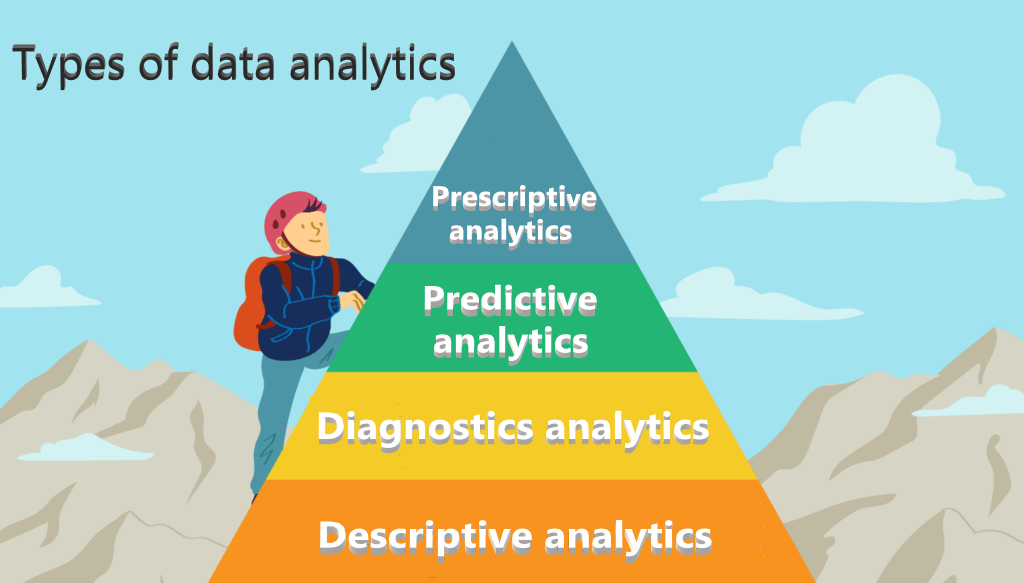
Types of Data Analytics
- Descriptive Analytics: explains what happened in the past by providing basic expository information such as who, what, when, where and how many, based on raw data.
- Diagnostic Analytics: explains why it happened in the past to help trouble shoot issues. The result of the analysis is often an analytic dashboard.
- Predictive Analytics: forecasts what might happen which help identify trends in relationships between variables, determine the strength of their correlation, and hypothesis causality.
- Prescriptive Analytics: recommends an action based on the forecast to eliminate a future problem or take full advantage of a promising trend.
Steps to perform Data Analytics
- Identify the data requirements and how to group data
- Collect data via wide range of sources
- Organize data by using spreadsheet or other format which can generate statistical or textual data
- Clean data to detect and correct corrupt data that obstruct data analysis process
- Analysis data by using different software or tools
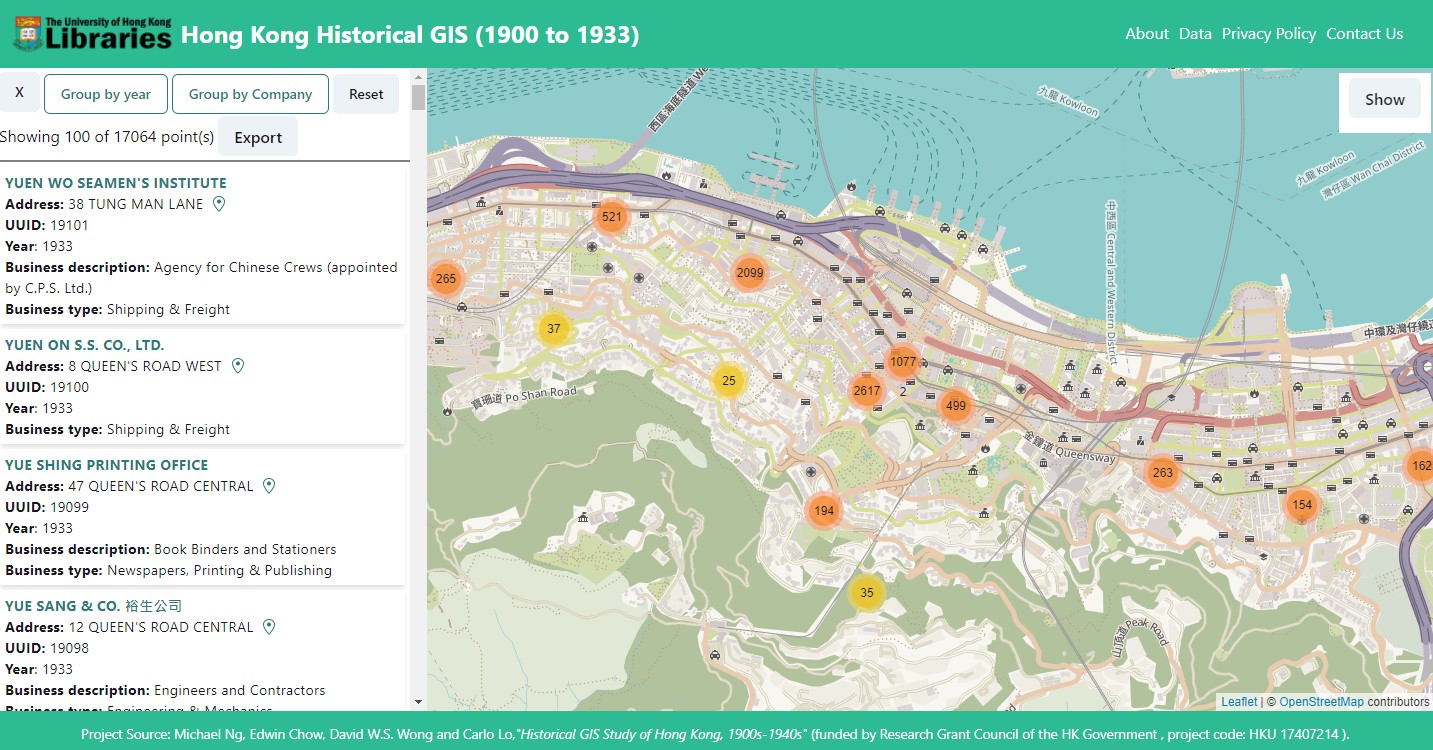
Geospatial Analysis
A Geographic Information System (GIS) is a computer application designed to perform a wide range of operations on geographic information. (Goodchild, 2009) Geographic Information is defined as information about locations on or near the surface of the Earth and may be organized in a variety of ways. Thus, a GIS includes functions to input, store, visualize, export, and analyse such information.
Reference:
Goodchild, M. F. (2009). Geographic Information System. Encyclopedia of Database Systems, 1231–1236. https://doi.org/10.1007/978-0-387-39940-9_178
Steps to make a basic map
- Prepare data
- Choose software - choose online / desktop mapping software according to desired output (i.e. interactive map / static image)
- Import data - add tabular, vector, raster or other data
- Design map - show patterns based on where the data is located or the attributes of the data itself
- Output map - share the link to online map or create a layout of map and export its image
Common Spatial Data format
- Shape file - The ESRI Shapefile has become an industry standard geospatial data format. At least 3 files with the same
- Prefix name and with the following extensions: .shp = shapefile, .shx = header and .dbf = associated database file Additionally, you may have a .prj = Projection file, a .lyr = layer file, and other index files
- KML or KMZ - XML based open standard (by OpenGIS) for GIS data exchange
- GeoTiff - TIFF variant enriched with GIS relevant metadata
- GeoJSON – a lightweight format based on JSON, used by many open-source GIS packages
Data Visualization
Data Visualization is a broad term for using graphical presentation to represent quantitative data to provide the viewer with a qualitative understanding of information contents via visual insights. Scientific Visualization and Information Visualization are often considered subsets of Data Visualization.
Scientific Visualization
Scientific Visualization "provides graphical representations of numerical data for their qualitative and quantitative analysis." (Hansen, & Johnson, 2011) It aims to improve interpretations of large data sets and to gain insights that may be overlooked by statistical methods. Scientific Visualization can be highly complex and specific to discipline. Examples include complex chemical hypothesis testing in laboratory, 3D modelling of human body for medical simulation, etc.
Information Visualization
Information Visualization is a set of technologies that “use of computer-supported, interactive, visual representations of abstract data in order to amplify cognition" (Card, Mackinlay, & Shneiderman, 2009) It means that using graphical presentation and user interface for gaining knowledge about the structure of the data and relationships in it. Examples include graphs with statistical model, network analysis for social network data, and map representation with spatial data, etc.
Infographics
Different from Information Visualization which create picture from a given set of data. Infographics means "a larger graphic design that combines Data Visualizations, illustrations, text, and images together into a format that tells a complete story" (Krum, 2013) which "gain direct attention, guide view transitions, and orient the user via visual narrative tactics". (Segel and Heer, 2010)
Visual Analytics
Visual Analytics is the science of analytical reasoning supported by interactive visual interfaces. (Keim et al. , 2009). The goal of visual analytics research is thus to turn the information overload into an opportunity which allows decision makers to combine their flexibility, creativity, and background knowledge with the enormous storage and processing capacities of today’s computers to gain insight into complex problems.
Best Practices in Data Visualization
The collision of communication, data science and design create good Data Visualizations which make large amount of datasets become meaningful and intuitive. Edward Tufte (2001), an American statistician and Yale professor, proposed that excellent Data Visualization consist of ‘complex ideas communicated with clarity, precision, and efficiency.’
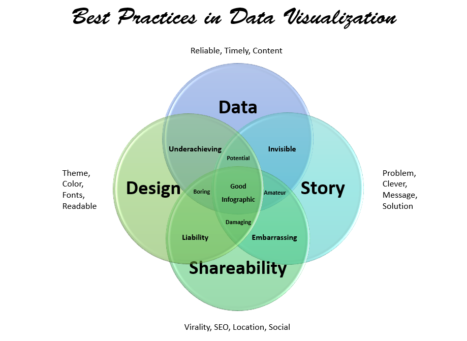
Clean dataset that is well sourced and completed is the first step to develop effective Data Visualization. Once your data is ready to visualize, choose to use a right chart type and select an appropriate color for specific data is needed in order to best present data and make the main points of a graph or chart easy for viewers to correctly figure out. The following are the 3 main points for good Data Visualization:
- According to underlying questions: Understand cleaned datasets can help inform the type of graph you use to visualize and communicate the results
- Choosing by data type: The chart type will depend on the data types such as numeric, categorical, mixed numeric and categorical, maps, network, or time series
- Color Consideration: Consider when choosing colors for different types of graphs, for example, using the same color for the same variables and using high contracts during comparison
References:
Card, S., Mackinlay, J. D., & Shneiderman, B. (2009). Information visualization. Human-computer interaction: Design issues, solutions, and applications, 181.
Hansen, C. D., & Johnson, C. R. (2011). Visualization handbook. Elsevier.
Keim, D. A., Mansmann, F., Stoffel, A., & Ziegler, H. (2009). Visual Analytics. Encyclopedia of Database Systems, 3341–3346. https://doi.org/10.1007/978-0-387-39940-9_1122
Krum, R. (2013). Cool infographics: Effective communication with data visualization and design. John Wiley & Sons.
Segel, E., & Heer, J. (2010). Narrative visualization: Telling stories with data. IEEE transactions on visualization and computer graphics, 16(6), 1139-1148.
Tufte, E. (2001). The visual display of quantitative information (2nd ed.). Cheshire, Conn.: Graphics Press.